

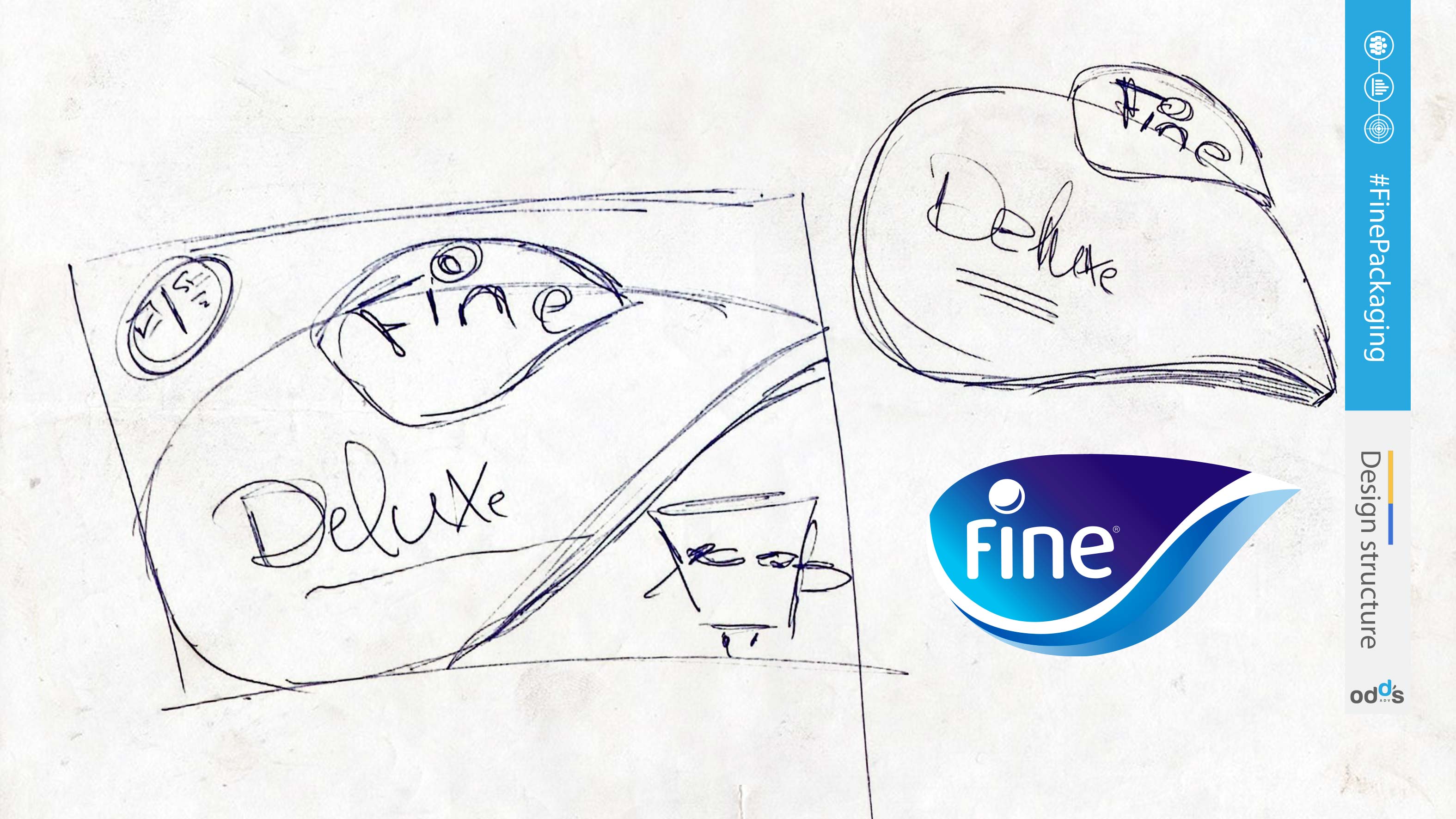
Fine's rebranding journey was a meticulous process, where every element was thoughtfully considered and designed. The new logo, a critical part of the brand's identity, was crafted to embody the brand's ethos and its commitment to quality and consumer satisfaction.
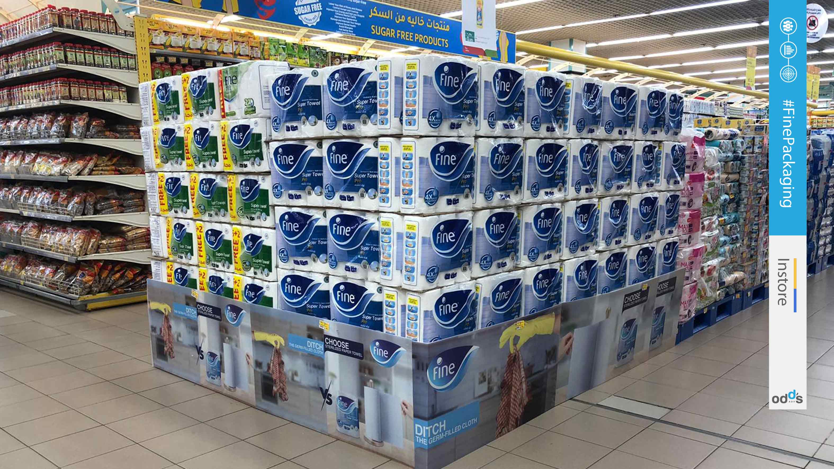
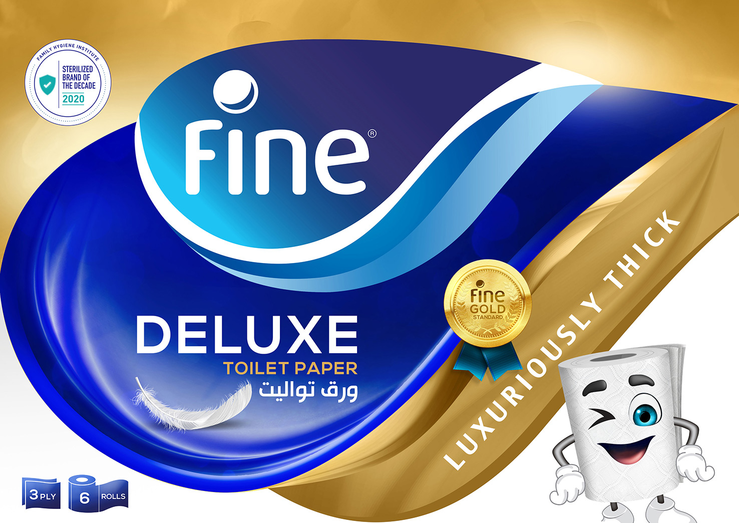
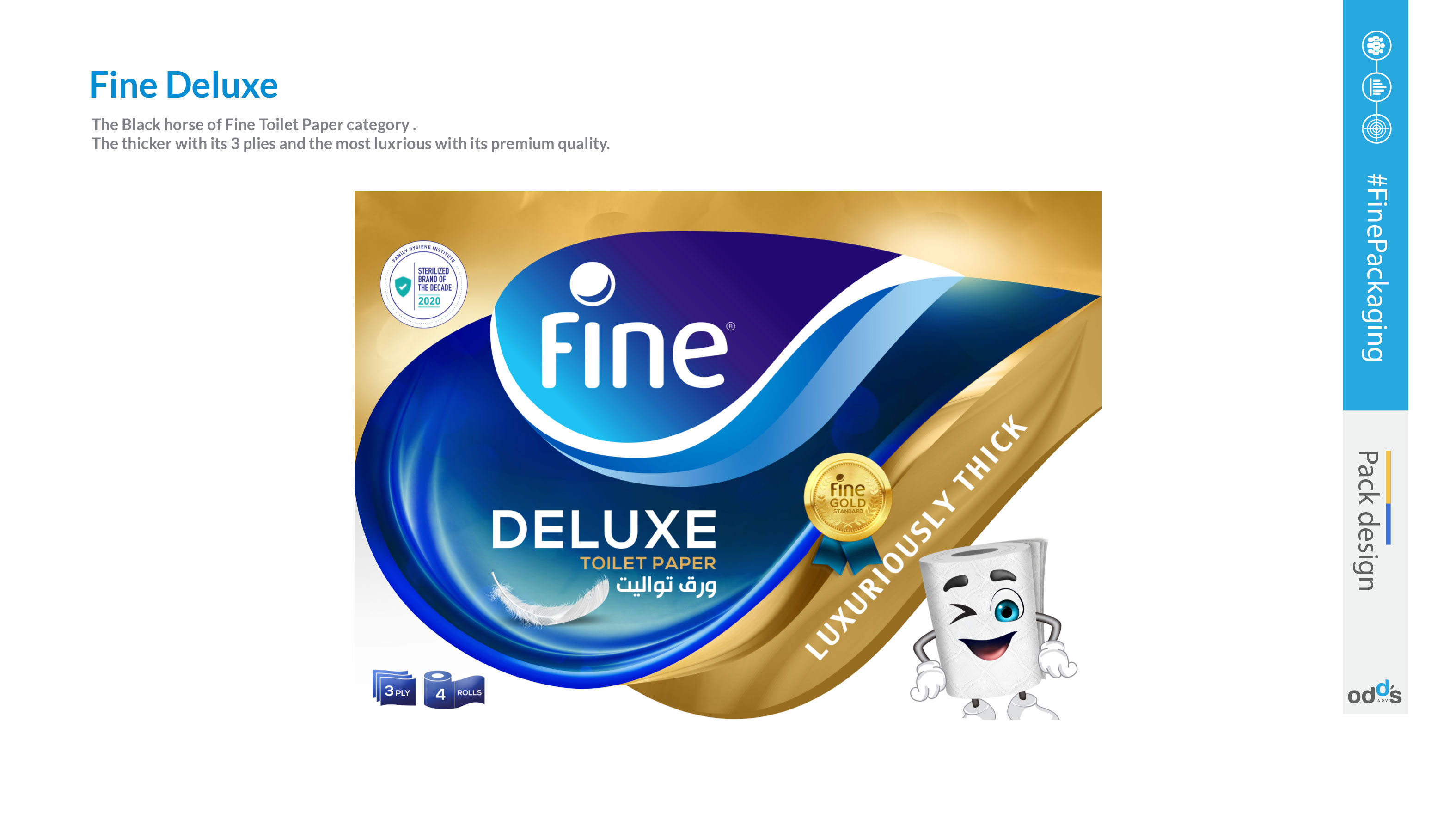
The packaging, too, underwent a transformation to reflect the renewed branding. The aim was to create a unified look that would resonate with the consumers and make the brand instantly recognizable. The design team worked diligently to ensure the new logo's shape was prominent and memorable, even in the subconscious mind of the consumer.
This rebranding was not merely an aesthetic change but a strategic move to reinforce Fine's position in the market and create a stronger connection with its consumers. The new packaging design serves as a visual cue, emphasizing the brand's evolution while staying true to its roots.


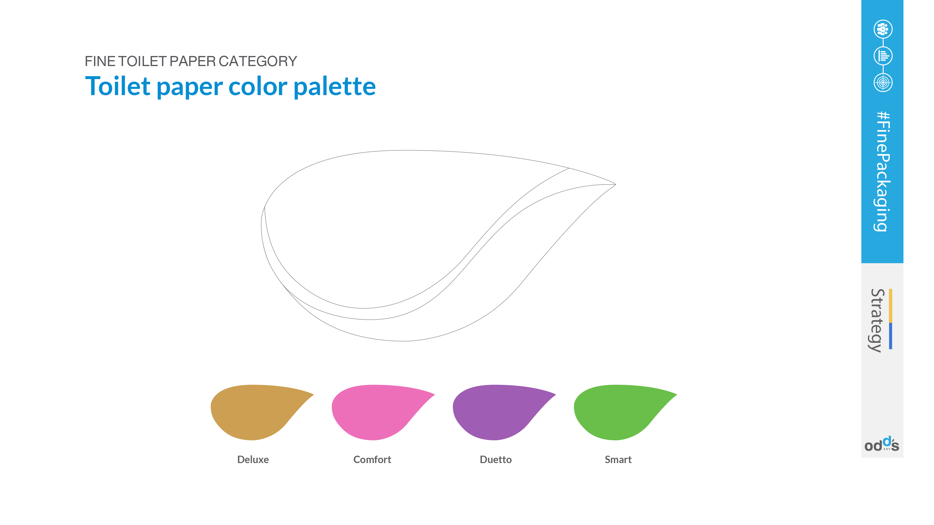


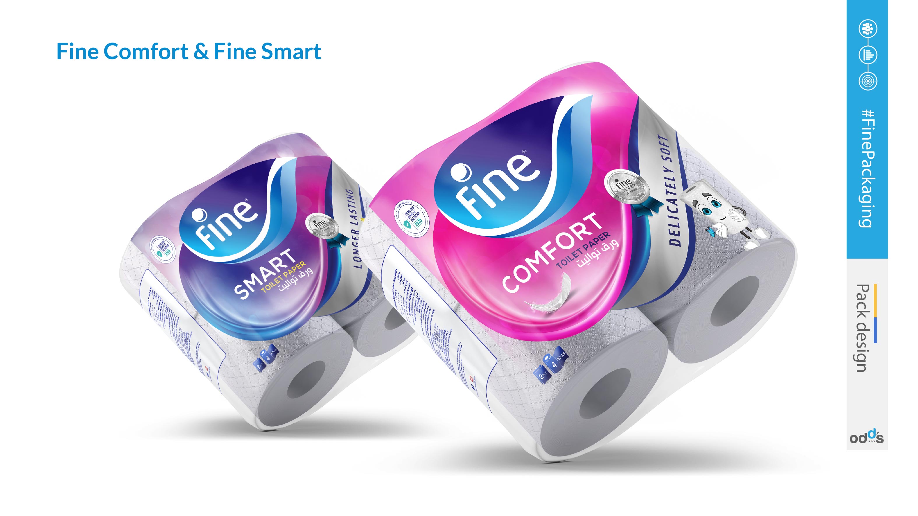

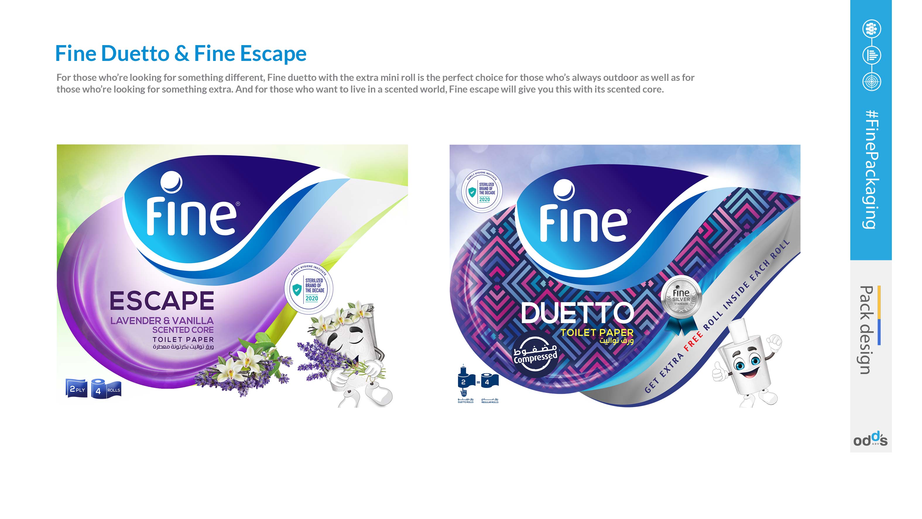
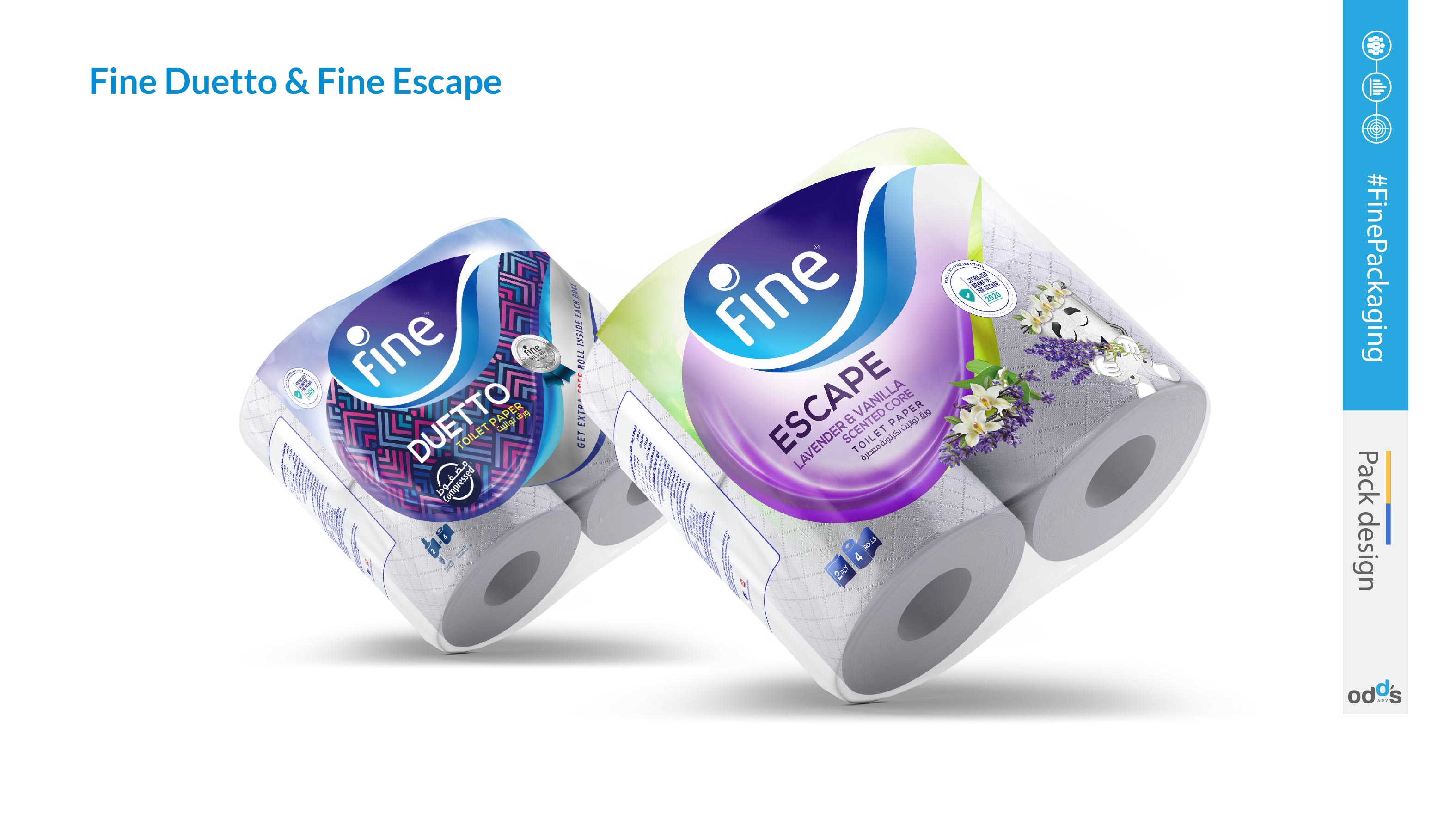
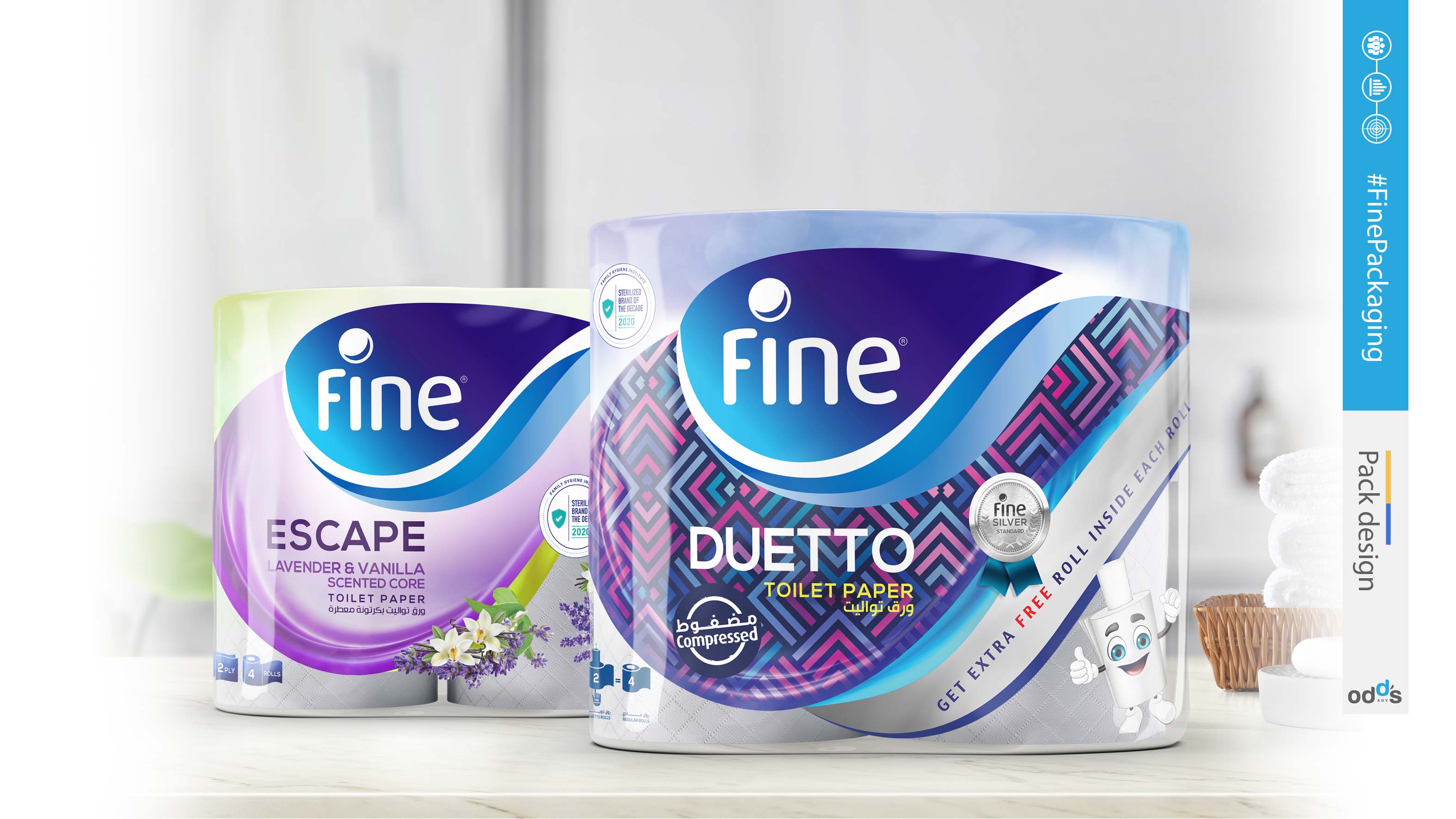


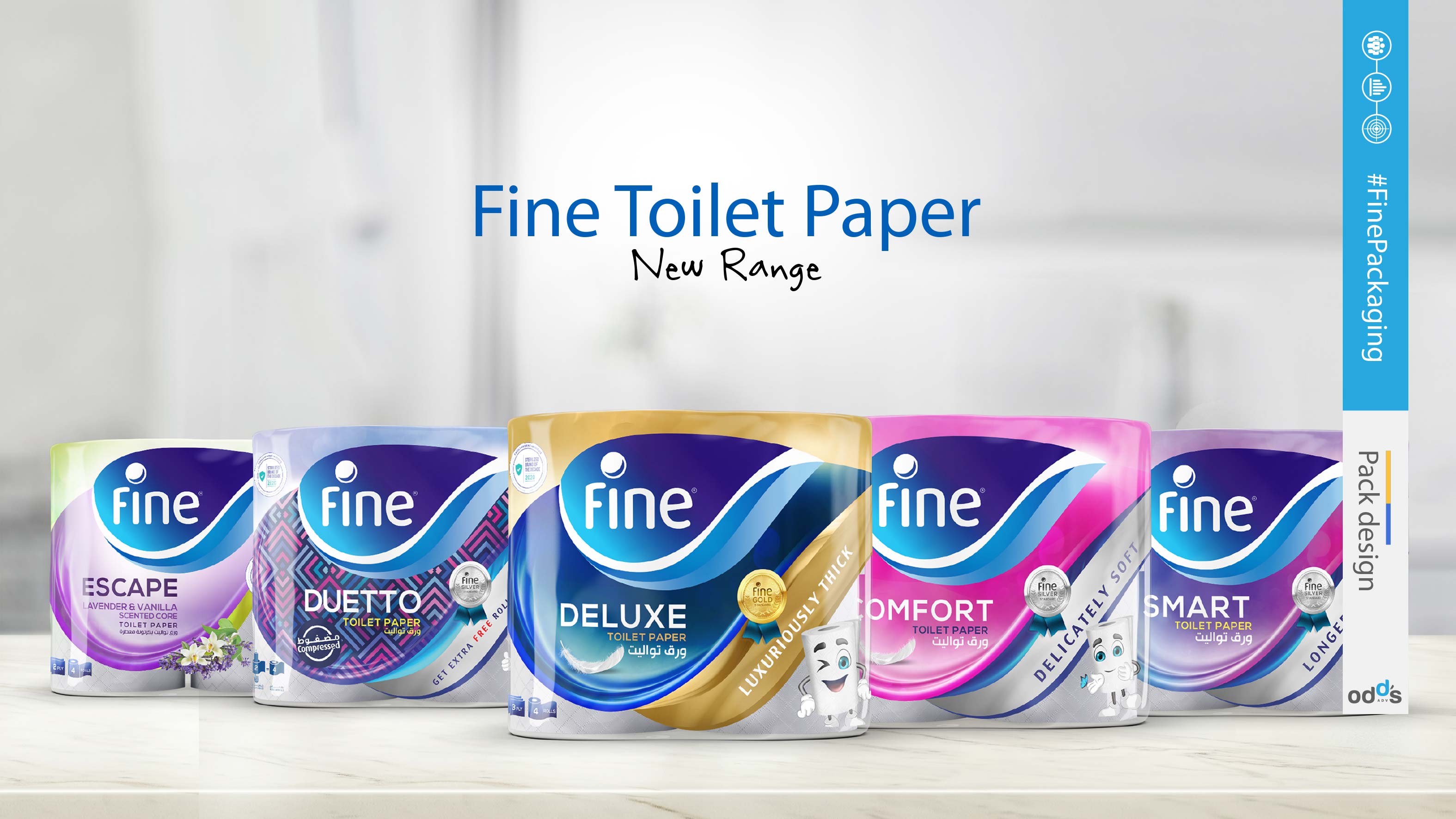
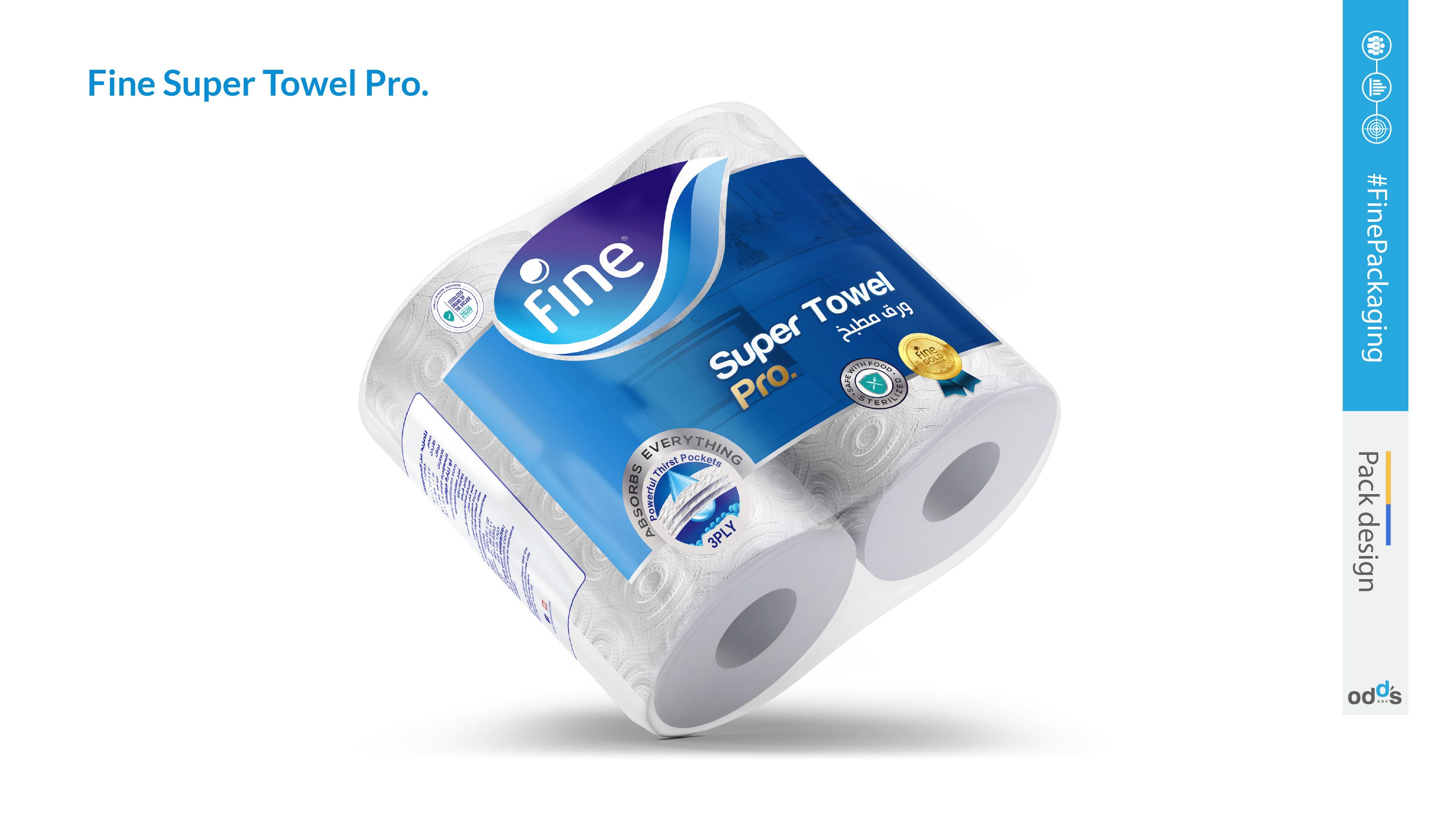
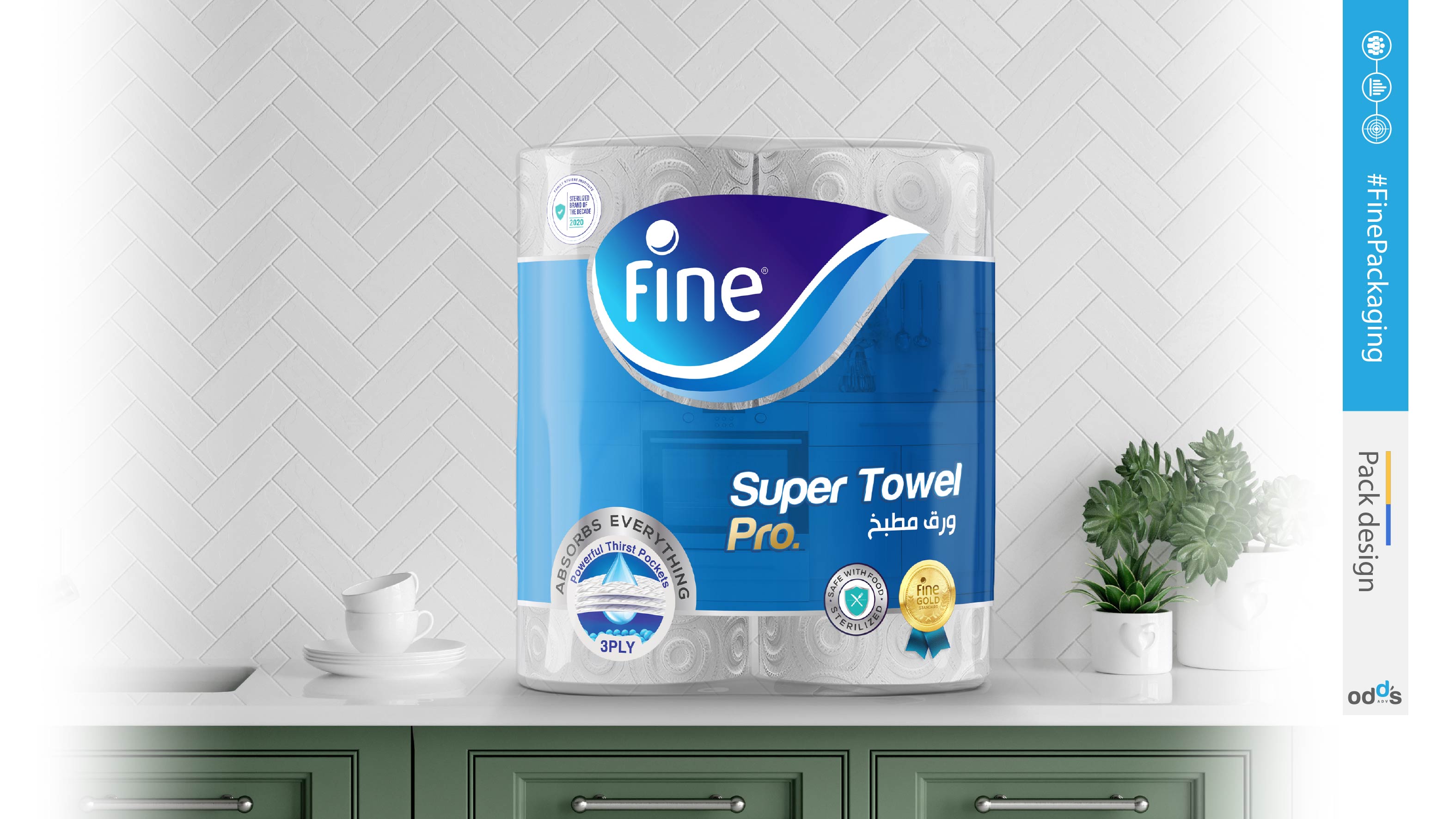
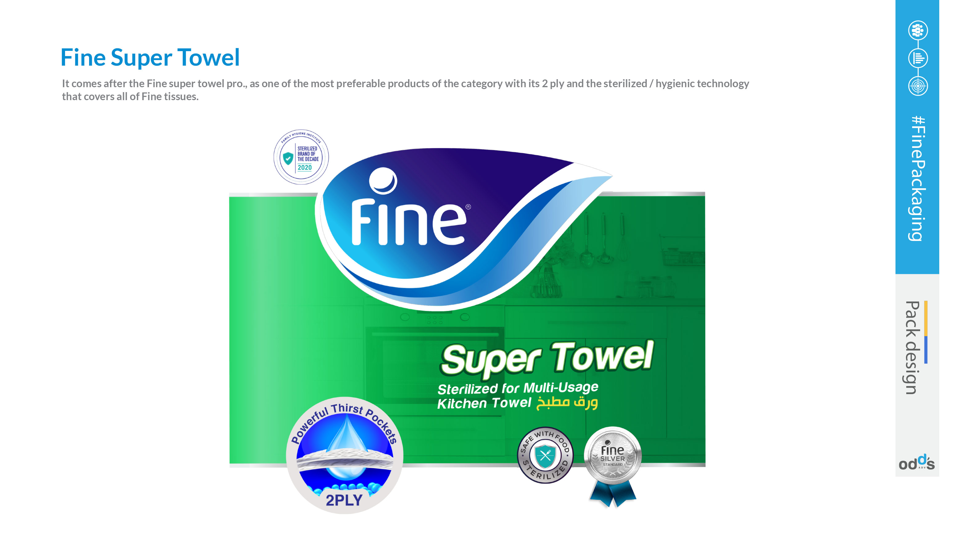
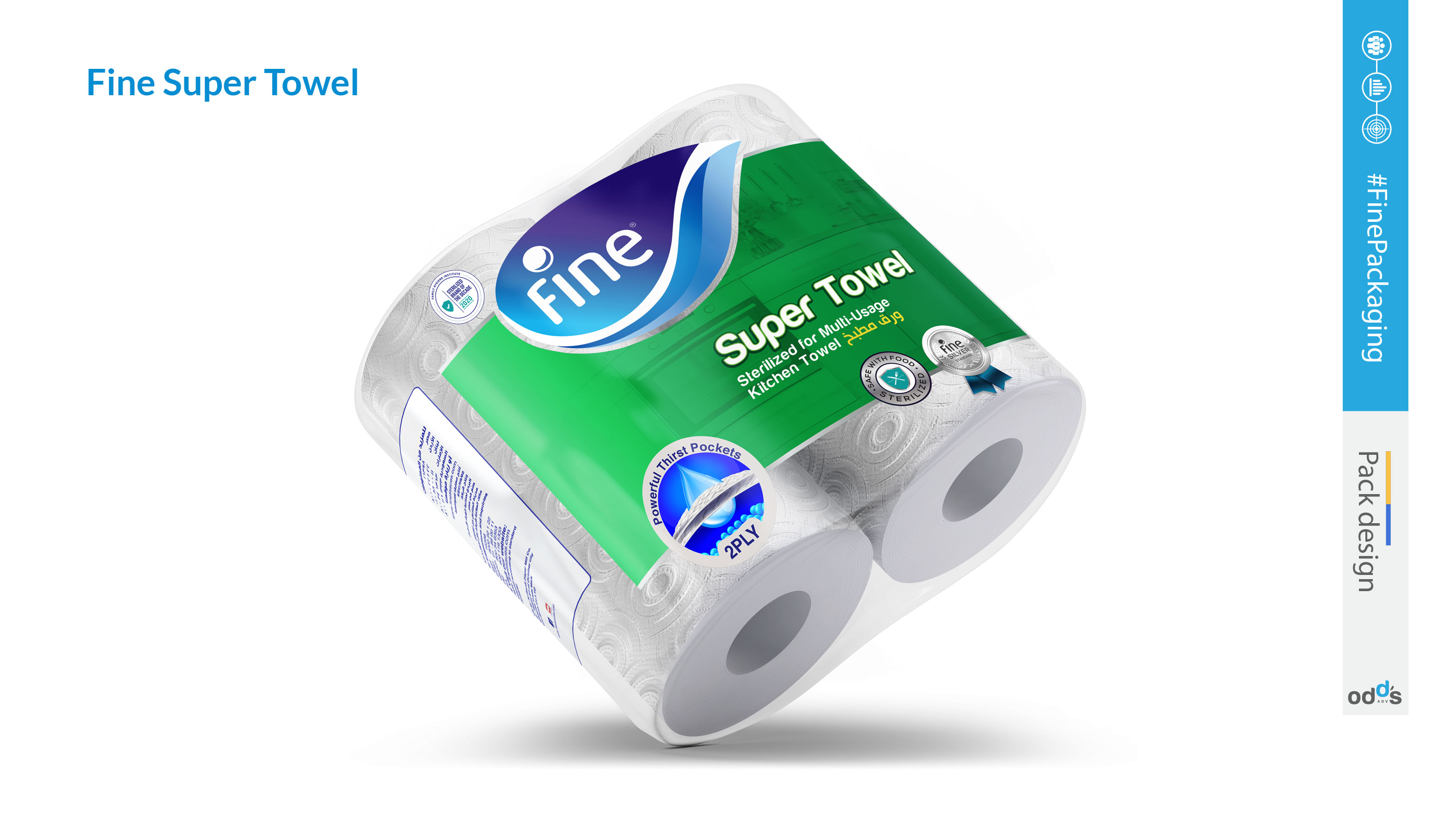
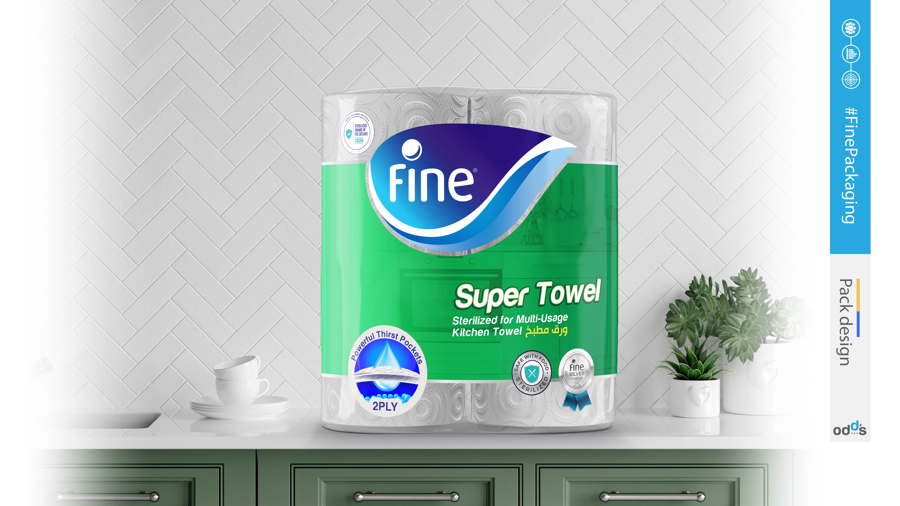
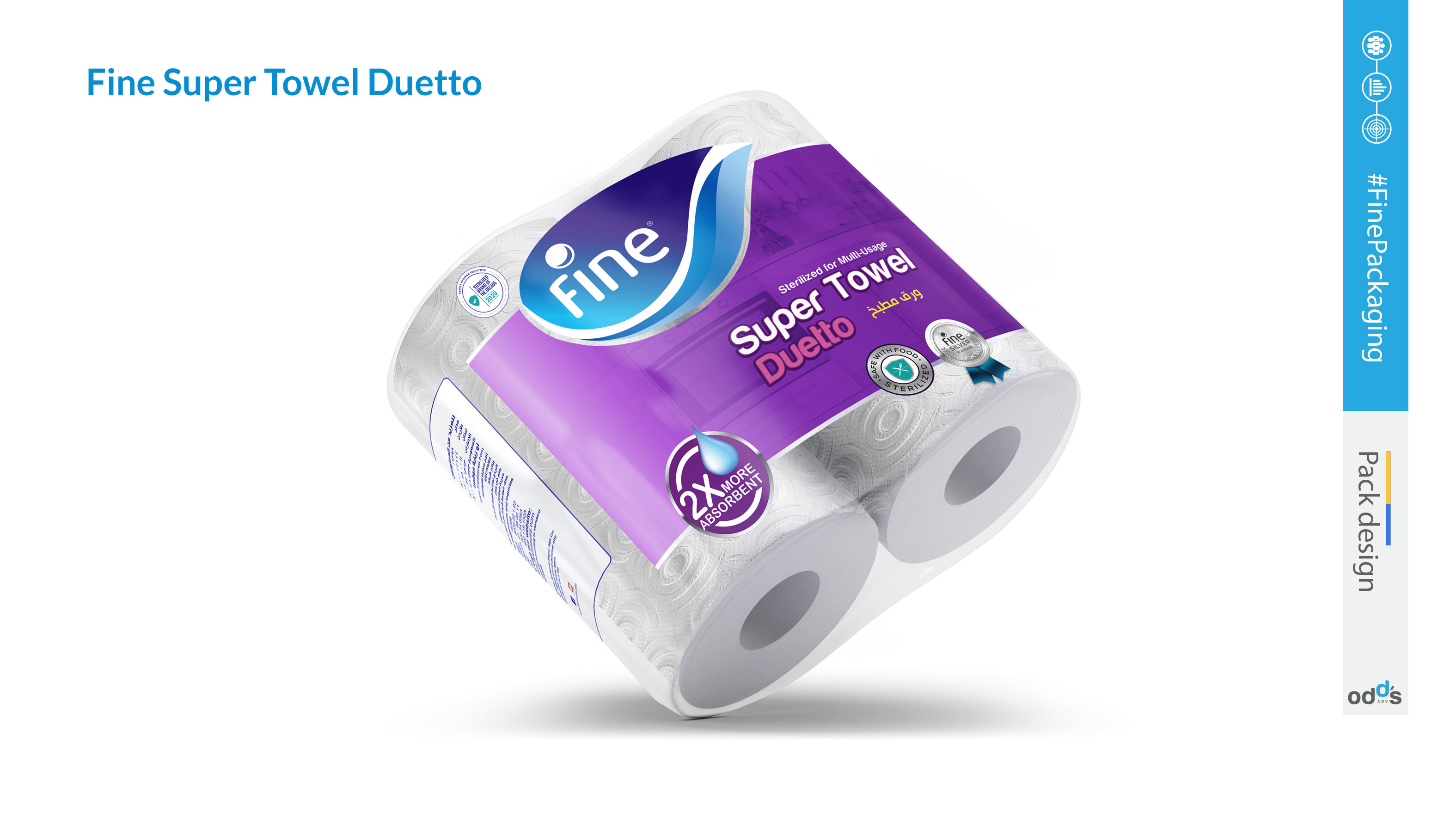
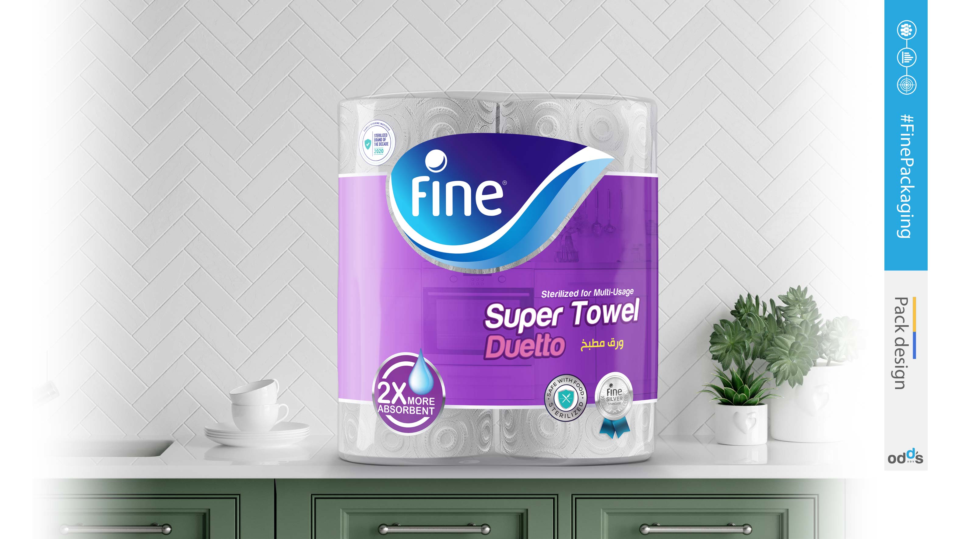
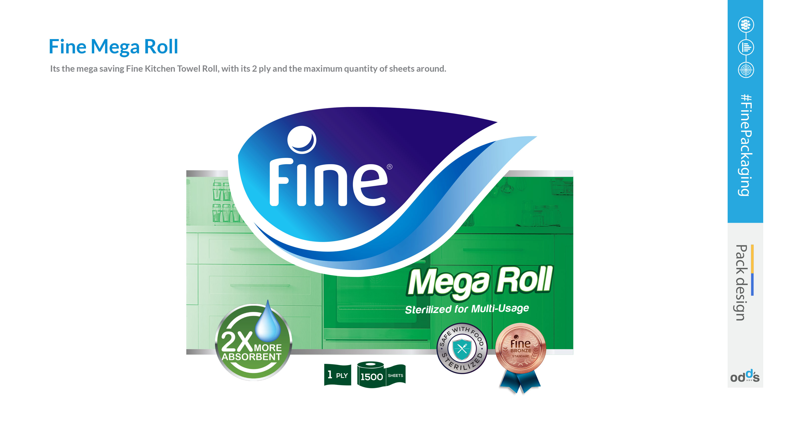
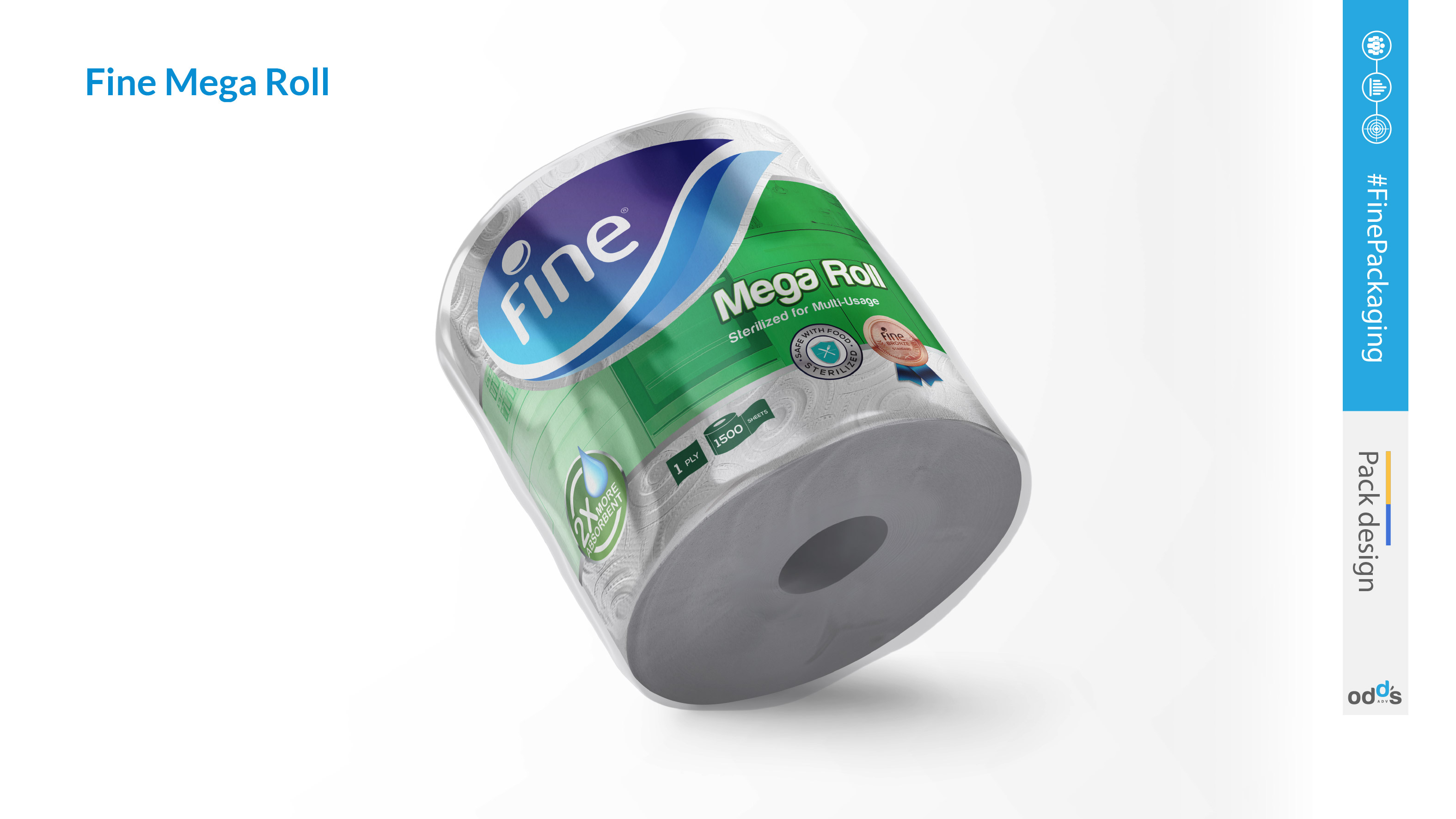
In response to the confusion discovered through market research, Fine embarked on redesigning the packaging for their toilet paper and kitchen towel products. The goal was to create a clear visual distinction between the two, aiding consumers in quickly and accurately identifying the product they need.
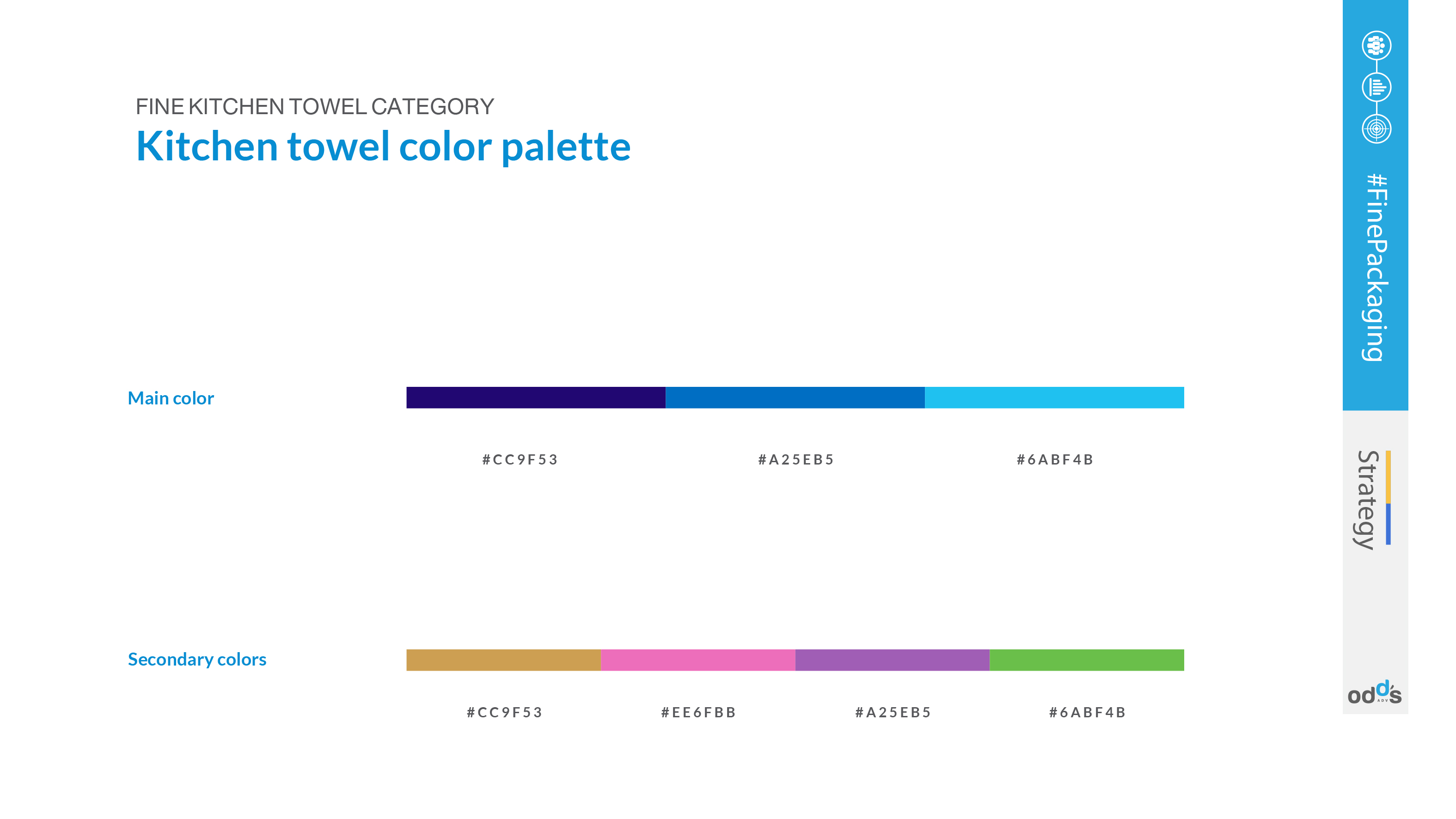
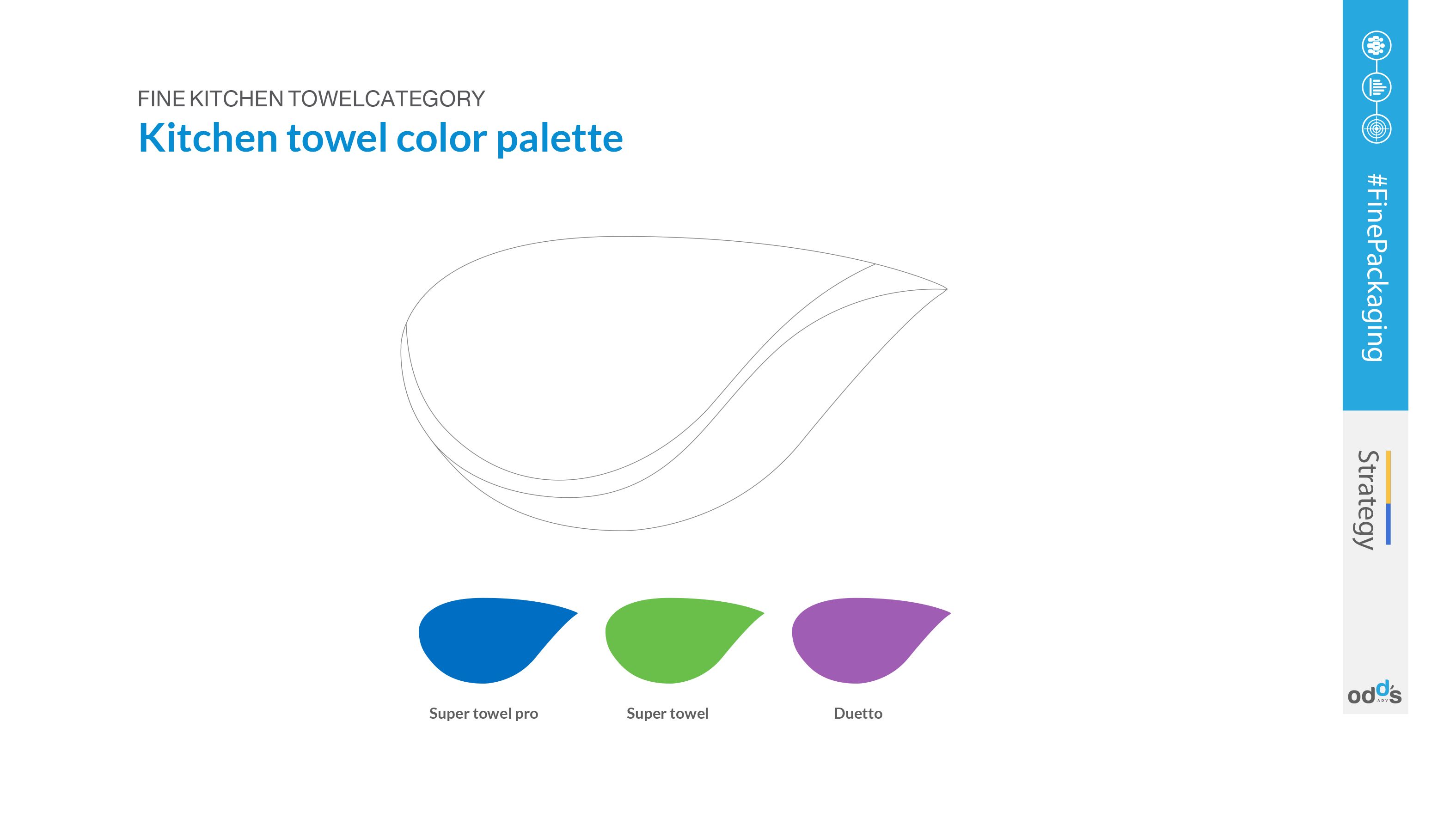
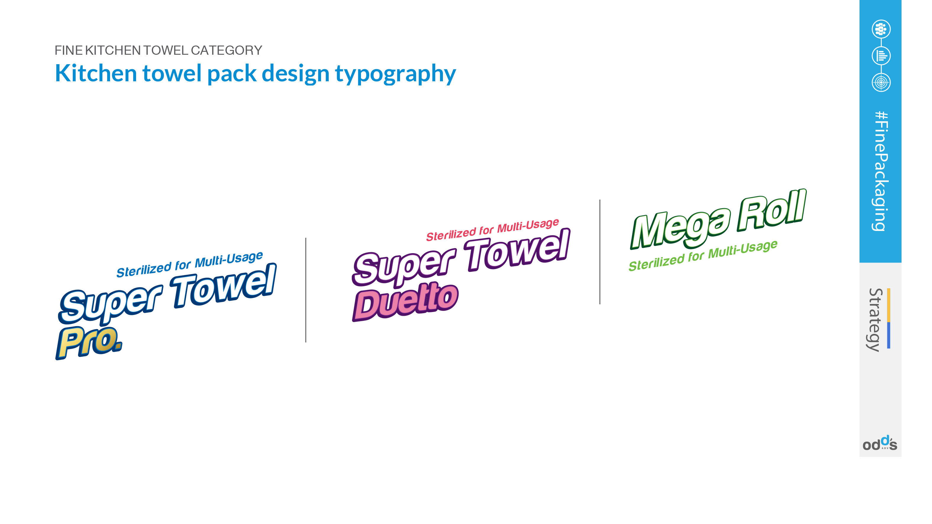
The design team focused on developing unique packaging for each product while maintaining the new brand aesthetic. They explored various color schemes, patterns, and images that would resonate with the function of each product. For example, the kitchen towel might feature imagery related to cooking or cleaning, while the toilet paper could have a more soothing, hygienic design.
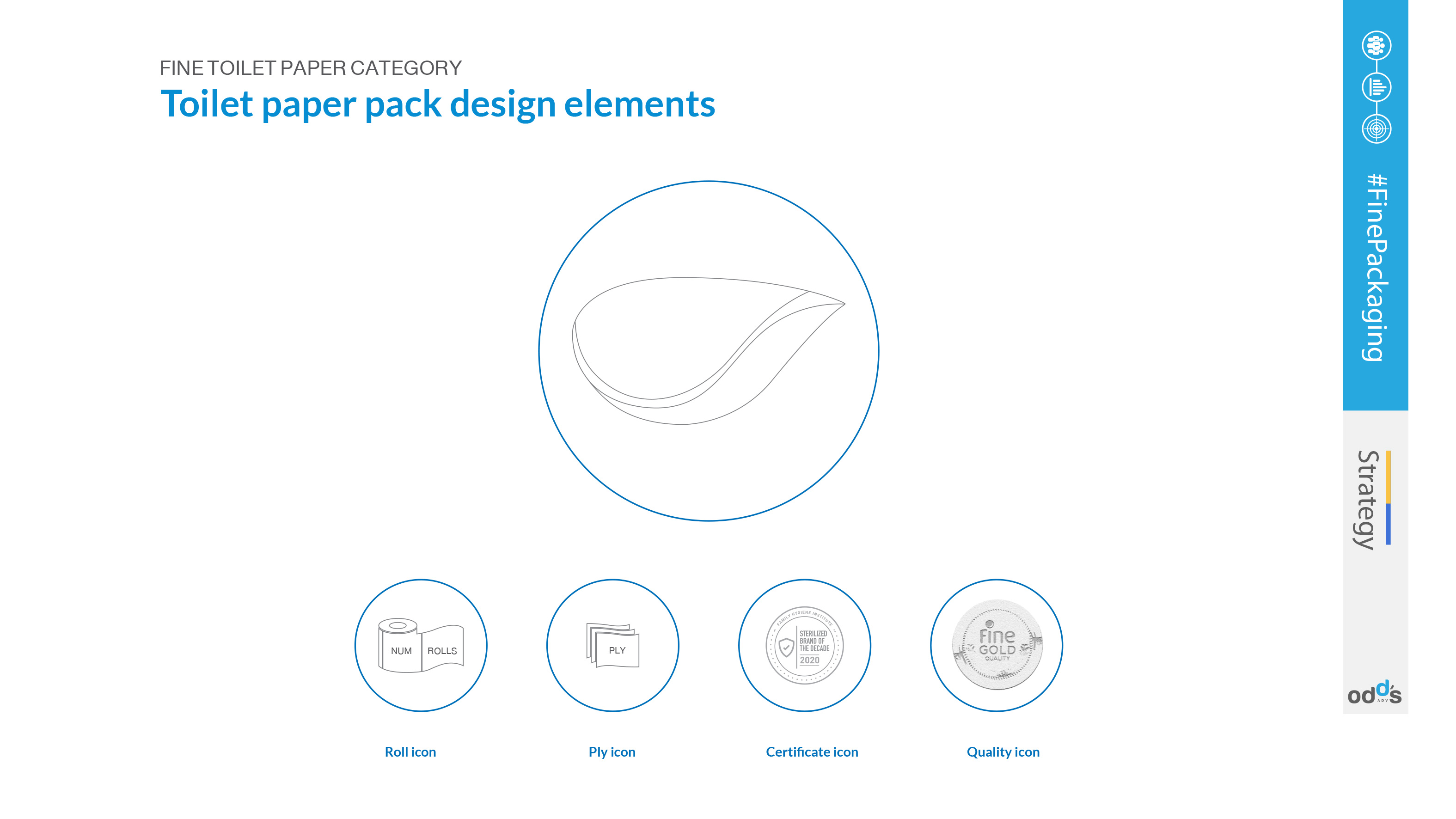
Additionally, Fine ensured that the new packaging was not only distinctive but also informative, clearly communicating the product's features and benefits. This strategy aimed to enhance the consumer shopping experience, reduce confusion, and reinforce Fine's commitment to customer satisfaction.